


How to combine and interconnect resources in the Tenerife Open Data portal
The visualization and study of the interconnections between data makes it possible to optimize the use of Open Data and is an essential element for the assimilation, understanding and analysis of data.
With this objective in mind, the Cabildo de Tenerife' sOpen Data portal offersusers a wide range of data visualization and analytics options, which we explain below, in order to make the most of its possibilities .
Inaddition to visualizing data through the dataset itself, you can opt for the function called "Dashboard", which allows you to visualize in parallel several graphs or datasets, configuring "dashboards" or "boards" based on the different visualizations and allowing you to share, embed or download the results obtained .
How does the data.tenerife.es dashboard work?
After entering the home page of the Portal datos.tenerife.es, you will have to access the "Data" block, through the option located at the top right of the page. When you open the "Data" menu, you will see, among the different options, the "Dashboard" function.
When accessing it, a button is displayed to select a resource to be displayed on the dashboard, in an agile and simple way. Clicking on the "select now" button displays a new window with a search bar, where you can enter the words corresponding to the data you wish to locate .
There is also the option of choosing one of the data sets already displayed under the search bar.
There is the possibility offiltering the search results through the options available on the left side of the window, by format, category or organization, in order to narrow down the results to be obtained.
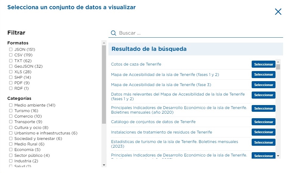
After typing the corresponding words in the search bar (or selecting the desired dataset), you will access the list of resources (distributions) available for this dataset, which can be displayed on the dashboard. Depending on the format of the resource you choose, the data will be displayed as atable, graph or map.
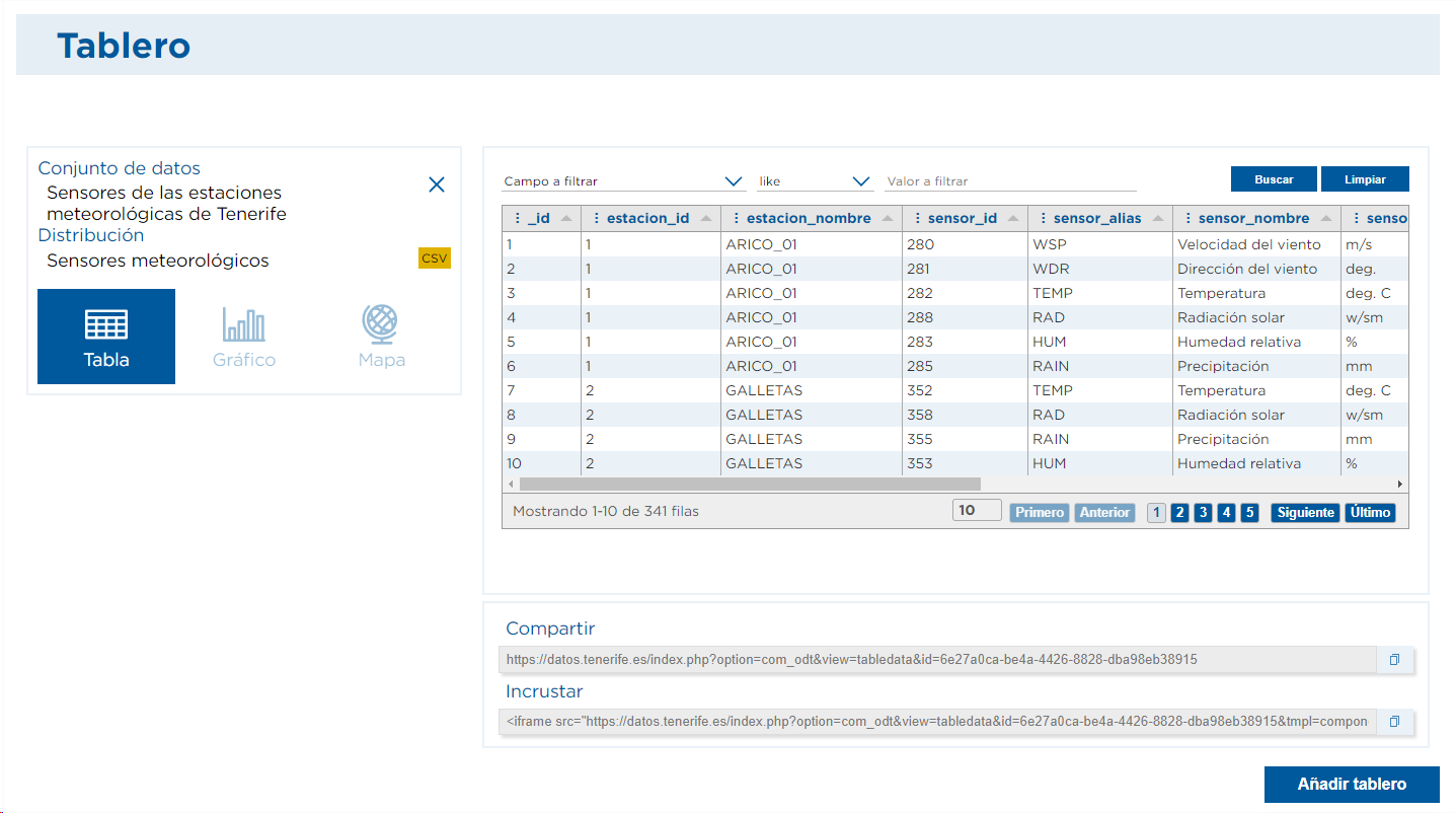
One of the main functionalities of the Dashboard lies in the possibility of being able to combine and compare different data. Once you have selected a first resource to be displayed, the "Add Dashboard" button will appear at the bottom of the page, allowing you to display different resources from one or more datasets simultaneously on the same page .
The Cabildo's Datos Abiertos portal allows you to combine up to three different dashboards, which generates a wide range of possibilities for data comparison.
Practical example: accessibility and trade data
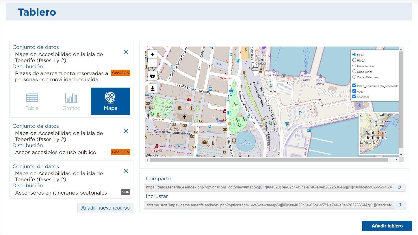
As a practical example, we are going to show you how you could visualize and cross-reference different resources related to accessibility, a section in which the portal offers from the visualization of the locations of parking spaces reserved for people with reduced mobility to the stairs and elevators that exist in pedestrian routes, among many other options .
In this practical example, we propose to select the data included in the Accessibility Map phases 1 and 2 of Tenerife and choose, as an example, the parking spaces reserved for people with reduced mobility, in GeoJSON format, to display them clearly on a map, as shown below .
By zooming in on the desired area, you will be able to view the locations of the different parking spaces reserved for people with reduced mobility and find out, among other details, their level of accessibility.

Atthe bottom of the page, under the map, you can obtain a URL to share the map or the HTML code to insert this map in your own web page.
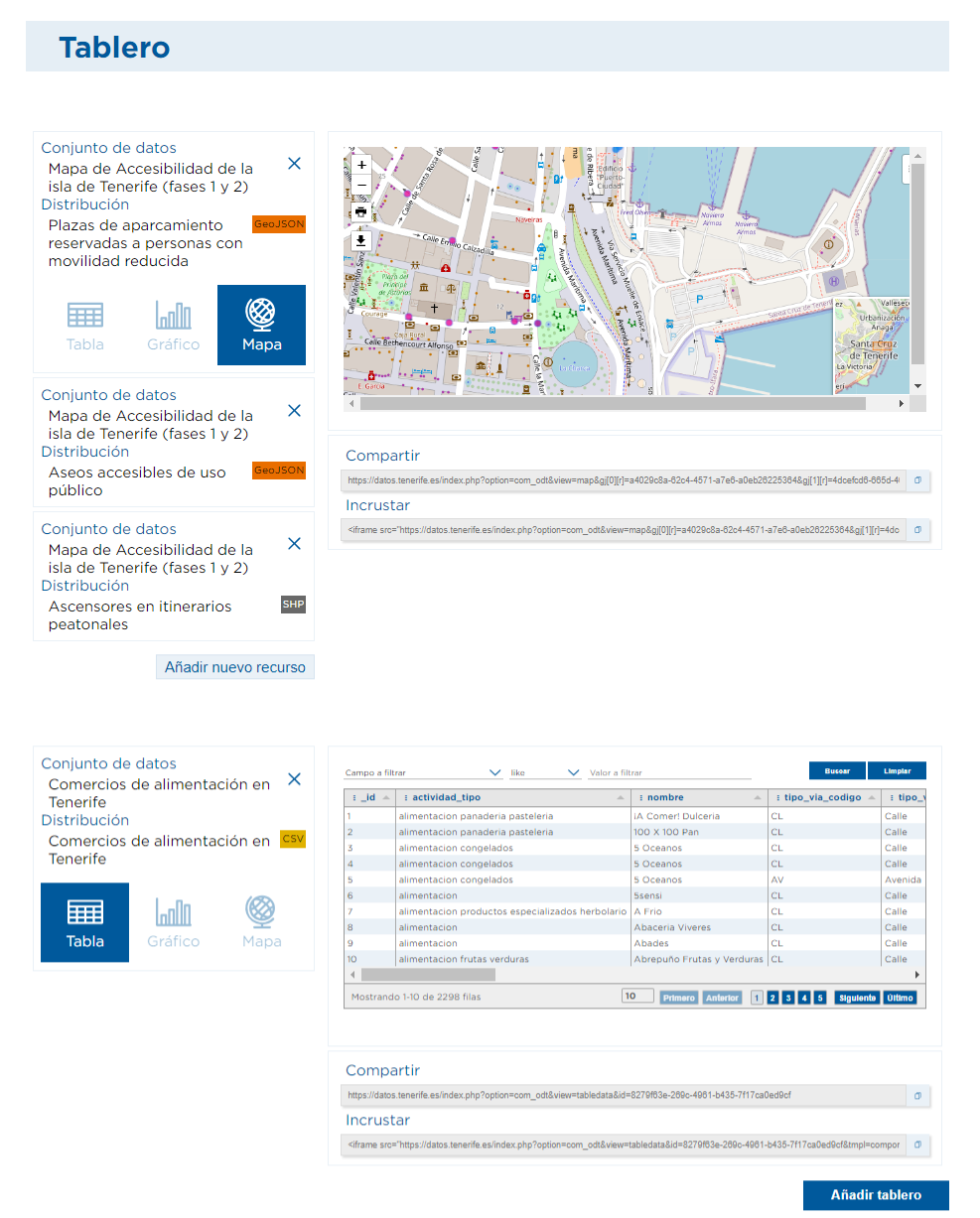
How to compare and combine resources on a map?
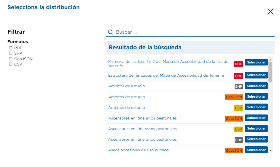
Since one of the main functionalities of the map visualization lies in the possibility tocombine and compare different data, several resources can be added, using the "Add new resource" button, located on the left side of the map. This function is also available through the dataset and is particularly useful for combining or comparing information.
Continuing with the example we have started from, we will again include "accessibility" in the search and select within the Accessibility Map phases 1 and 2 the resource of accessible toilets for public use in GeoJSON or SHP format, which will allow us to visualize its location, on the same map, with a different color than the parking spaces.
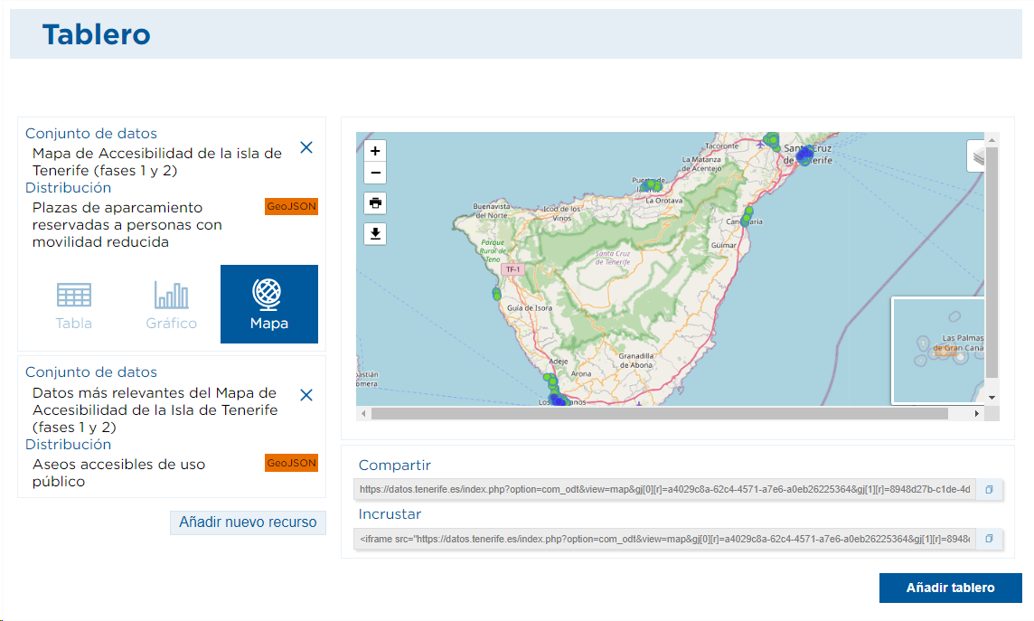
The portal also gives the option to choose different backgrounds or to activate or not the resources that had been added, as can be seen in the upper right box of the map itself. In this way, each of the resources represented can be identified.
How to add another board with graphs or tables?
In order to get to know the different forms of visualization that we can add to the board, we will incorporate different resources. As an example, let's look at the existing datasets within the "commerce"category , where we find the commercial food establishments of the island, available in different formats. In this case, we are going to add the information offered by the portal in XLS format, which will be displayed by default using the table visualization.
In this case, the Portal offers a very interesting possibility. This is thegraphicaldisplay . Thus, by choosing this option, you can not only graphically represent the data but also download or export the resulting graph.
In the case of data from food stores, after selecting the Chartoption , you must choose the type of chart to be used and then the fields or attributes that contain the values to be represented.
In this example, the column chart has been chosen and the representation using the "municipality" field, which allows you to see the distribution by localities of the food stores.

The Cabildo de Tenerife Portal incorporates different types of graphs: bar, column, funnel, pie, histogram, histogram, area, line, rectangle, radial and scatter .
Thus, the possibilities generated are very broad. One could, for example, opt for a pie chart showing the distribution by "activities".
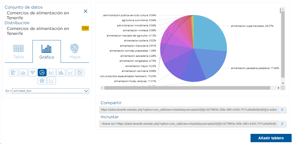
Inaddition, in the case of the graphs, by clicking on the"three dots" in the upper right-hand corner of the box, thegraph can bedownloaded in PNG, JPG, PDF or printed .
With these brief examples, we have tried to offer a quick and simple view of the possibilities of "combining and interconnecting" the resources of the Cabildo de Tenerife's Open Data portal , but it is clear that the possibilities are almost endless .
So it only remains to encourage you to access datos.tenerife.es and to develop the visualizations that most interest you to embed and share data in an agile and effective way .