


Data visualization in graphs
As we saw in previous posts with the visualization of tabular data, the Open Data Portal of the Cabildo de Tenerife allows you to visualize certain datasets in graph format, which helps you to understand the most relevant information.
Today, through different datasets available on the portal, we will focus on how to work with this type of visualization and the advantages it offers us.
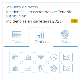
To begin with, let's open the "Incidents on Tenerife roads" dataset. Once in the dataset, we enter the visualization of any of its resources in CSV format and, in turn, on the left side of the screen we access the "Chart" option.This is where we start configuring our chart.
Within this option, we will see 10 different types of graphs, from which we can choose:
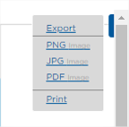
For all these types of graphs we will have the option to export them in three different formats or print them by accessing the menu available with the three dots button at the top right of the graph.
Bar Chart
Bar charts summarize and compare categorical data using proportional bar lengths to represent values. Bar charts are composed of an X-Axis and a Y-Axis. The X-Axis represents discrete categories that correspond to one or more bars. The Y-Axis is where we can see the values, i.e. the numbers or quantities to be expressed.
We have already selected a data set, the chart option and we have decided that we want to generate a bar chart. How do we proceed?
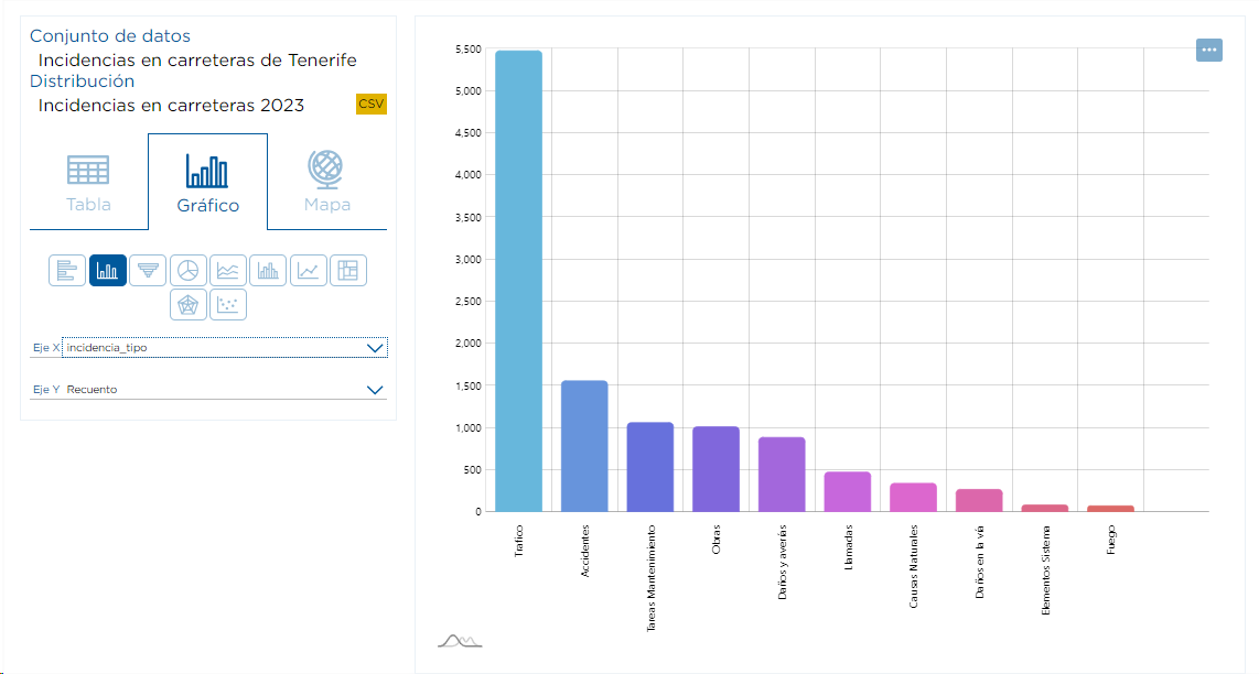
When we select this typology, a drop-down menu will appear in which we can select the value we want to display on the X-axis. This time we will choose "incidence_type".

The portal will generate a graph where you can see, at a glance, the different types of incidents reported on the roads and for each of them the number of occurrences, clearly distinguishing which are the most or least common.
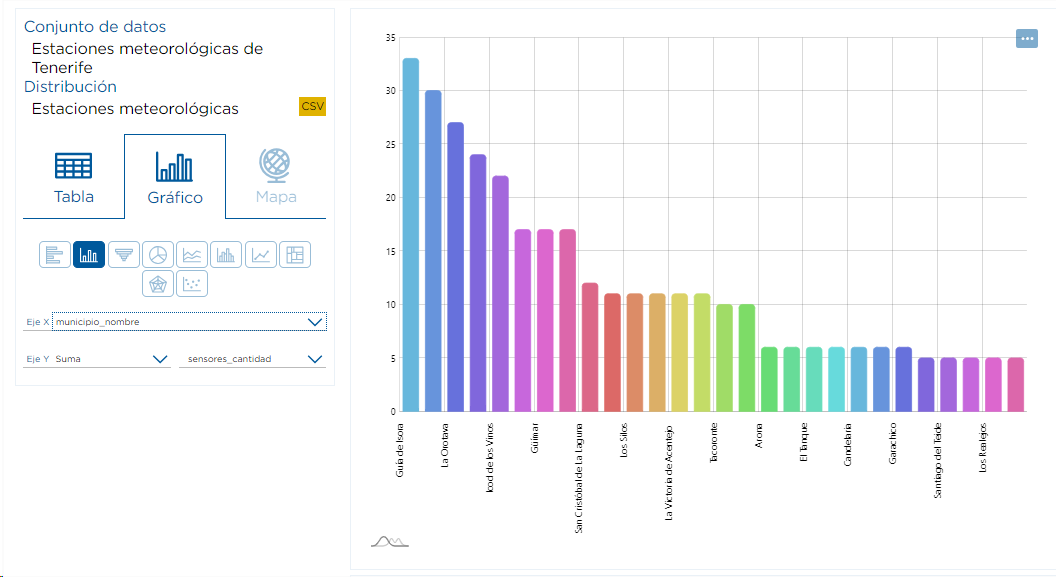
The Y Axis shows the operation being carried out, as shown in the previous graph, the occurrence count is performed, but we can also obtain the Average, Sum, Minimum or Maximum of the different numerical variables of the resource. For example, when selecting the set "Tenerife Weather Stations",we select for the X Axis "municipality_name" and in the Y Axis the "Sum" of the column "sensors_quantity". This way we can analyze the sum of the values collected by municipality name.
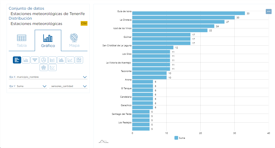
In this graph the total number of meteorological sensors per municipality is obtained.
Column chart
A column chart, like a bar chart, allows us to compare data using different column lengths .
We represent the same examples as in the previous section vertically.
As with the bar chart (and the rest of the charts from now on), by choosing a resource that contains numerical data and not simply categorical (text) data, we can use an operation other than counting and perform an operation using the desired numerical column.
Funnel plot
A funnel chart is a graphical representation used to visualize how data moves through a process. In a funnel plot, the value of the dependent variable decreases in later stages of the process.
Let's change the data set and take as a reference the data set "Influx of recreational areas in Tenerife". We want to know the percentage of affluence according to the type of unit (tourism, tent, motorhome, etc). To do this, we will choose the funnel plot and in the X Axis we choose "unit" and in the Y Axis "Sum" from the column "quantity".
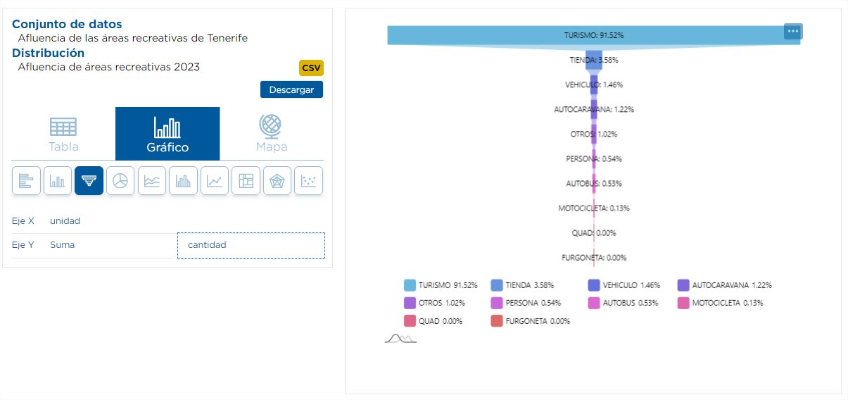
In the graph we can see the percentage according to the type of unit, taking into account the quantity column, ordered from highest to lowest .
This chart has the option of "eliminating" some specific cases, i.e., by clicking on the values in the legend, the percentages are recalculated, eliminating the selected values from the chart, which will remain in the legend in gray color.
Pie chart
Pie charts show categories as a proportion or percentage of the whole. Use pie charts to show the composition of the data of a category in which each segment is proportional to the quantity it represents.
We will perform the same example as in the previous case, but using the pie chart.
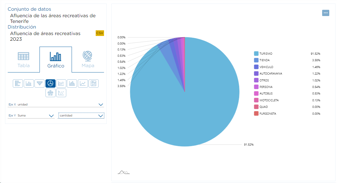
In the previous graph we can see that the users of the camping and recreational areas have a preference for the use of tourism to access these areas. As in the previous graph, we can "eliminate" some specific cases by clicking on the values in the legend.
Area chart
An area chart is a chart that combines aline chartand a bar chart to show changes in quantities over time.
For this type of chart, it is strictly necessary that the column selected for the X-Axis is of type date (e.g. 2023-01-02T08:36:00).
Within the set of "Nature activity bookings in Tenerife", we will go to the area graph option and select for the X Axis "start_date" and in the Y Axis "Sum" and the column "number_of_people". In this way, we will be able to analyze the sum of people enrolled in nature activities collected by date.
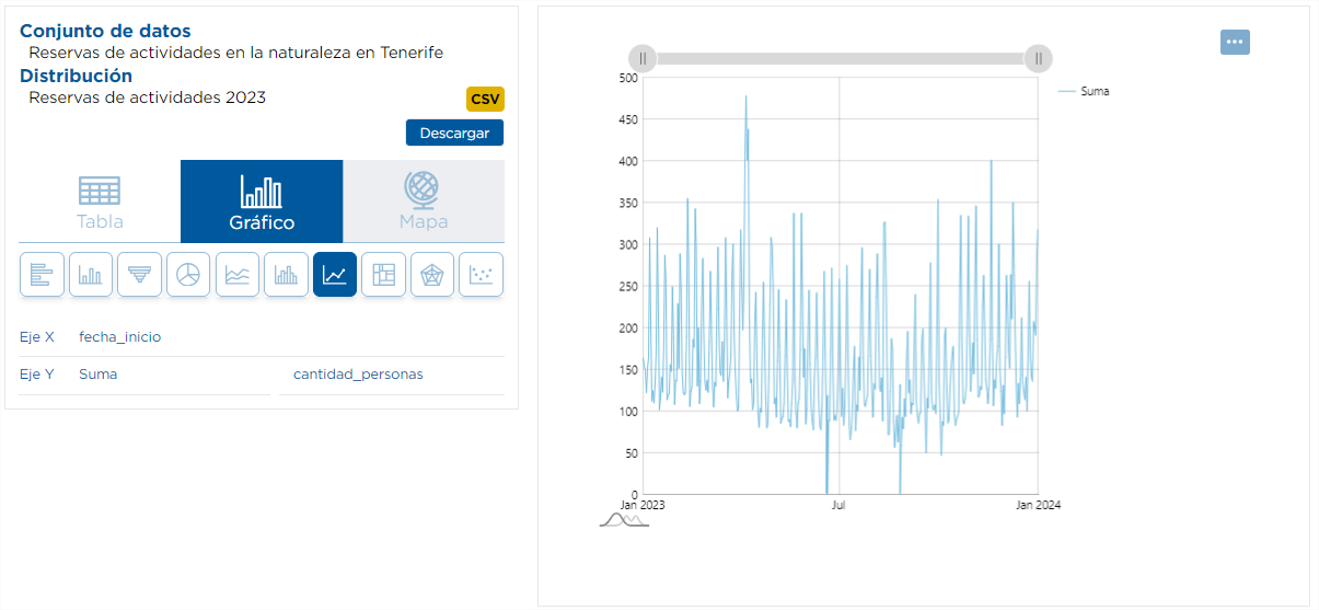
In the upper area of the graph there is a gray bar that allows us to select the period of dates to be displayed.
Histogram graph
A histogram is a graphical representation of a numerical and continuous variable in the form of bars, where the surface of the bar indicates the total number of values in the interval.
For this type of representation it is necessary that the resource has at least one numerical column.
In this case we are interested in knowing how the number of available places is distributed taking into account the set "Tourist accommodations in Tenerife".
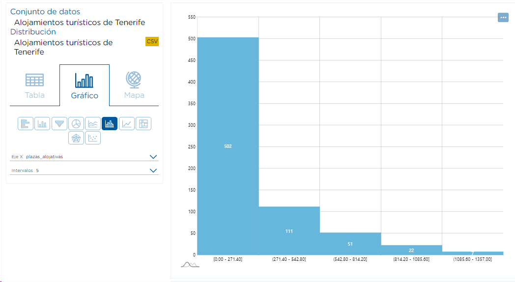
We have grouped the number of places available in Tenerife's accommodations in 5 intervals and we can see that 502 accommodations have less than 272 places and 7 have more than 1086.
Line graph
Line charts allow us to visualize changes over a continuous range, such as time or distance. Visualizing change with a line chart allows you to see the overall trend at a glance and simultaneously compare multiple trends.
Again, as with the area chart, the X-Axis column needs to be of type date in order to display information. If you select a data set that does not meet this condition, you will not be able to view the line chart or the area chart.
To exemplify this, we will do it again through the set "Reservations of nature activities in Tenerife", but visualizing other information. In order to analyze the number of caravans used in the activities we select "start_date" in the X Axis and in the Y Axis "Sum" in the column "caravan_quantity".
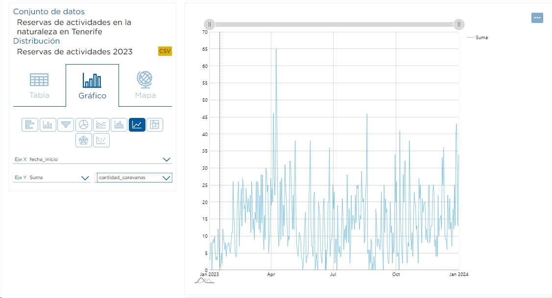
In the upper area of the graph there is a gray bar that allows us to select the period of dates to be displayed.
Rectangle chart
The rectangle chart allows us to have a hierarchical view of the data from rectangles whose size depends on the chosen data.
We return to the data set "Influx of recreational areas in Tenerife". This time we want to know which recreational areas are receiving more affluence during 2023. In Axis X we will choose "toponymy". In theY Axis , we will choose as operation to apply "Sum" and the "quantity" column.

Radial chart
Radial charts are used to evaluate different options based on multiple variables. They allow us to display one or more variables in a two-dimensional graph; each radius corresponds to one variable.
We access the data set "Sensors of the meteorological stations of Tenerife". This time we want to know the number of meteorological sensors of each type. To do this, we can choose the type of radialgraph , in the X Axis "sensor_name" and in the Y Axis "Count".
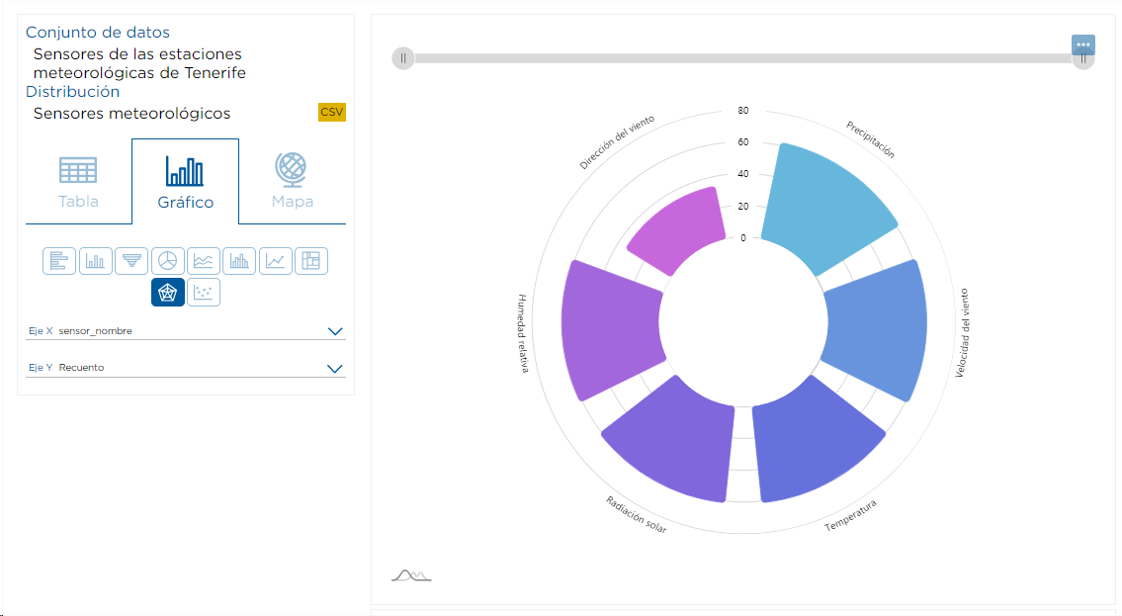
With the gray bar we can remove values from the graph.
Scatter plot
Scatter plots show numerical coordinates on the X-axis and Y-axis. They are used to find out to what extent one variable is affected by another.
For this type of representation it is necessary that the resource has at least two numerical columns.
We are going to use the data set "Nature activity reservations in Tenerife" to see the correlation between people and caravans.
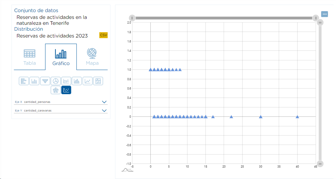
It can be seen that there is no linear relationship between the number of people and the number of caravans. In addition, this graph allows you to view specific data by dragging the ends of the gray bars at the top and right of the graph.